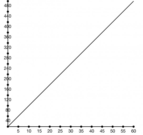
The above graph is an example of how you might want to draw the graph of y=8x on graph paper. The x axis is the hours worked and the y axis the pay received.
| x hours |
$y pay |
| 10 |
80 |
| 20 |
160 |
| 30 |
240 |
| 40 |
320 |
| 50 |
400 |
| 60 |
480 |
The table shows some of the values, and each row of the table corresponds to a point on the line.
The graph is better than the table for filling in the gaps that occur in the table. But the table gives accurate values. The equation gives the means to determine exact values, but it requires you to do a calculation, while the graph values can be read off from the coordinates without having to do any calculations.