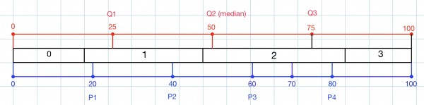
The picture shows the quartiles (Q1, Q2, Q3), the pentiles (P1, P2, P3, P4) and the 70th percentile.
The data is shown in the “sandwich” between the quartiles and pentiles. From the picture we can see where the 20th, 25th, 50th, 70th, 75th percentiles are in the dataset: 1, 1, 2, 2, 2 respectively. The 84 data values represent 100%. In figures, these are 16.8, 21, 42, 58.8, 63. Each square tile in the grid represents a data frequency of 5. For example, there are 15 data with 0 errors, shown as 3 tiles.
